
Stock Photo Horror Story: Why You Should Always Check for Property Releases
July 11, 2019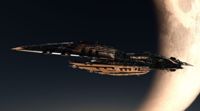
Classic or Cliché? The Science Fiction Spaceship Cover
July 24, 2019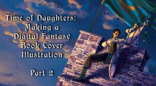
The conclusion of a walkthrough of my process in creating a fantasy book cover illustration for a novel by Sherwood Smith.
In my previous post, I talked about the process of assembling a photomontage and painting over it to create a greyscale underpainting. I also defined “photomontage,” “photobashing,” and “overpainting.” In this piece, I use the techniques of photomontage and overpainting.
“Glazing” with blending modes
I originally learned to paint using oils. My favorite technique in oil painting is to create a monochrome underpainting, then glaze thin layers of color over the top. The glazes tint areas of the painting and allow light to go through the glaze layers and bounce off the underpainting.
I simulate this technique in Photoshop with a greyscale underpainting, to which I add layers of color using blending modes. Layers can be set to blend in different ways with the underlying layers, tinting them in various ways.
The video below is by David Belliveau, the lead instructor at Paintable, demonstrating one way of using this technique.
Glazing with blending modes has a tendency to leave a grey cast under areas of the painting. As a result, you will need to paint over the adjustment layers with color. For this reason, some artists don’t like using this technique, but as I said, I started out with oil painting and it’s what I enjoy doing.
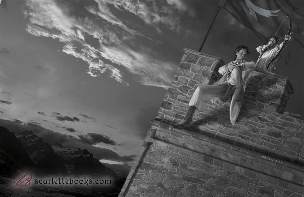
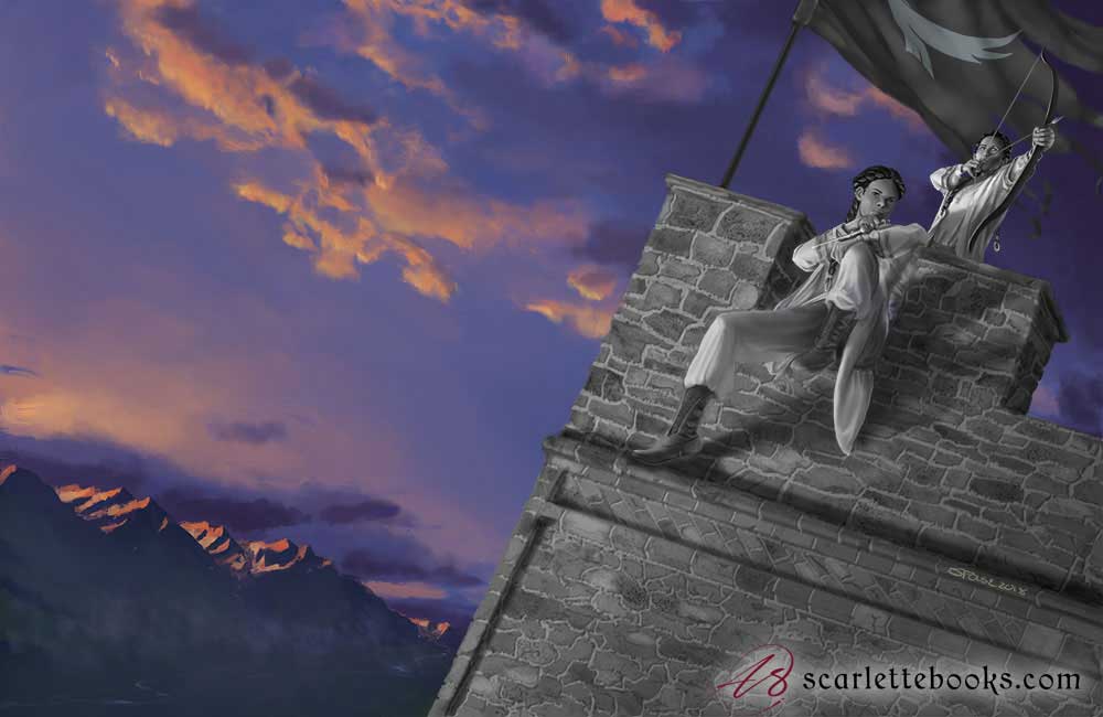
Underpainting in greyscale
Here is the basic underpainting. The painted foreground is on top of a photomontaged sky and distant landscape, as I am not concerned with creating a detailed underpainting for them. The background serves as a frame for the foreground, and as a wash of color for the back cover text to go on when it’s a printed book, and therefore shouldn’t be distractingly detailed.
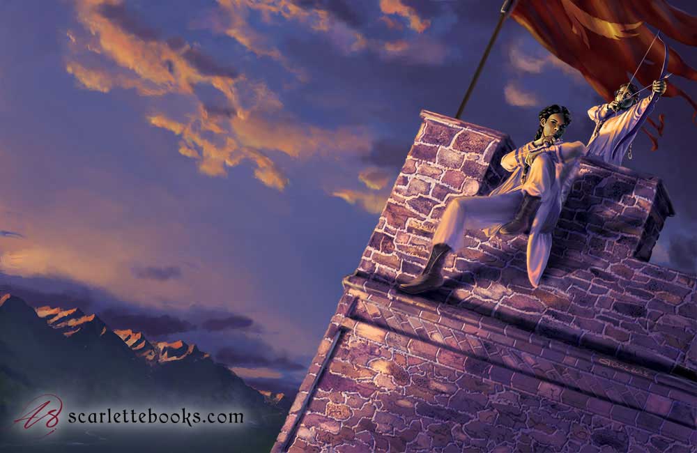
Blending layers
In the picture below, I tint areas of the greyscale painting using gradient maps. A gradient map uses the light and dark parts of the layers below it to calculate what color shows.
- The banner has the simplest gradient map: the lightest parts are gold, and everything else is red.
- The background uses a gradient map that goes from orange to purple to green as values get darker.
- I tinted the clothing with a map that goes from pale yellow to a blue-ish purple, with the transitions zones a saturated orange.
- The skin tones use a map that starts yellow and goes through a slightly saturated brown before it turns into purple.
The stone wall is tinted using a Color blending mode, which just changes the color data below it and leaves the lightness and darkness values alone. I painted splotches of color onto different stones by hand for this layer.
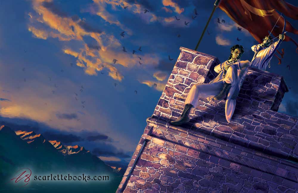
Starting the overpainting
I turn off the layers on top of the foreground to focus on the sky and the far background. On layers on top of the gradient map, I began the process of overpainting the landscape, sky, and clouds. I used various Photoshop brushes to start working in a painterly style.
Foreground
The next step is to overpaint the foreground, intensifying the colors and starting to add in details. You can see secondary light that tints the darkest shadows on the characters and parapets blue, and gives pale blue outlines to the shadowed side of their faces and figures.
Overall color adjustments
At this stage, I start looking at the effect of the entire picture. It’s far too purple overall, which is flattening the image and blending the figures into the background more than I want. I adjust the colors and pump up the blues in the sky and shadows to create contrast. This makes the seated figure the focal point, as I intended.
I also add bird silhouettes to give some more texture to the sky. I lightly erase the silhouettes as they get farther away to mimic atmospheric fading.
Details
Now is the time to work on details: highlights, gold thread woven into the hair, colored edgings on the clothing, and more. Smith pointed out to me that the pants weren’t supposed to be white. I went back to the brief she’d given me and realized I’d misunderstood the colors of the pants and boots, so fixed them.
Side note: This is why you should create a formal cover brief. I was relying on a bunch of emails for this, which meant I had to search through my inbox to find the correct one. I made a formal brief for the next cover I did for someone else and had that author sign off on it, which made it simpler for me to reference. Look for a post about the process of painting that one in the near future!
I also gently roughed up the left edge of the castle wall to break the line up, because the too-straight line made the wall look unnatural.
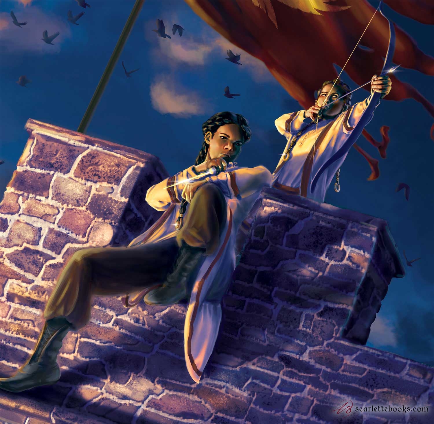
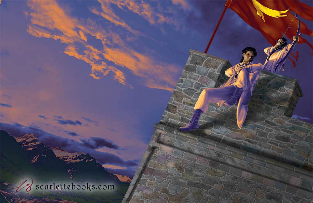
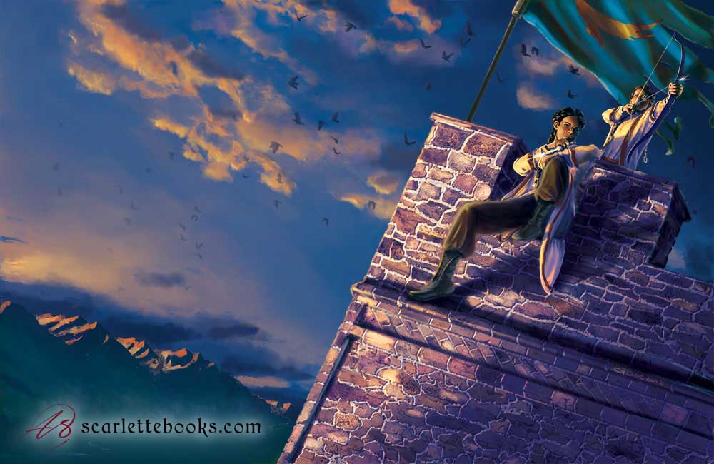
Banner and final version
At this point, Smith realized she’d told me the wrong color for the banner. I kept the layers separate in Photoshop, so it was fairly simple to go back in and repaint the banner, starting with a new gradient map and finishing with overpainting and details.This is the final version of the cover art.
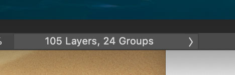
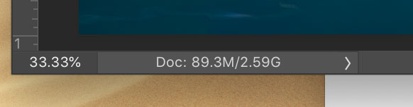
Photoshop layers
By the time this cover illustration is finished, I have 105 separate layers! It’s also 89MB in size, and takes up 2.5 GB of memory when open.
I swear my computer was crying by the end of this painting, and every time I saved the file, I had to sit and wait a bit for the program to finish.
I hope you enjoyed seeing the process that went into this fantasy book cover art! If you did, please subscribe to my monthly newsletter, which will let you know about new blog posts. Use the form in the sidebar. If you’re in the market for a book cover painting, whether it’s sci-fi illustration or fantasy art, please talk to me.
