

5 Reasons Not to Use Free Stock Photos on Your Book Cover
July 3, 2019Stock Photo Horror Story: Why You Should Always Check for Property Releases
July 11, 2019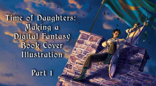
The first part of a walkthrough of my process in creating a fantasy book cover illustration for a novel by Sherwood Smith.
Sherwood Smith commissioned me to create book cover art for her novel Time of Daughters. Smith worked with me before to create photomontage covers for other of her books, but she wanted a classic fantasy book cover painting for this novel.
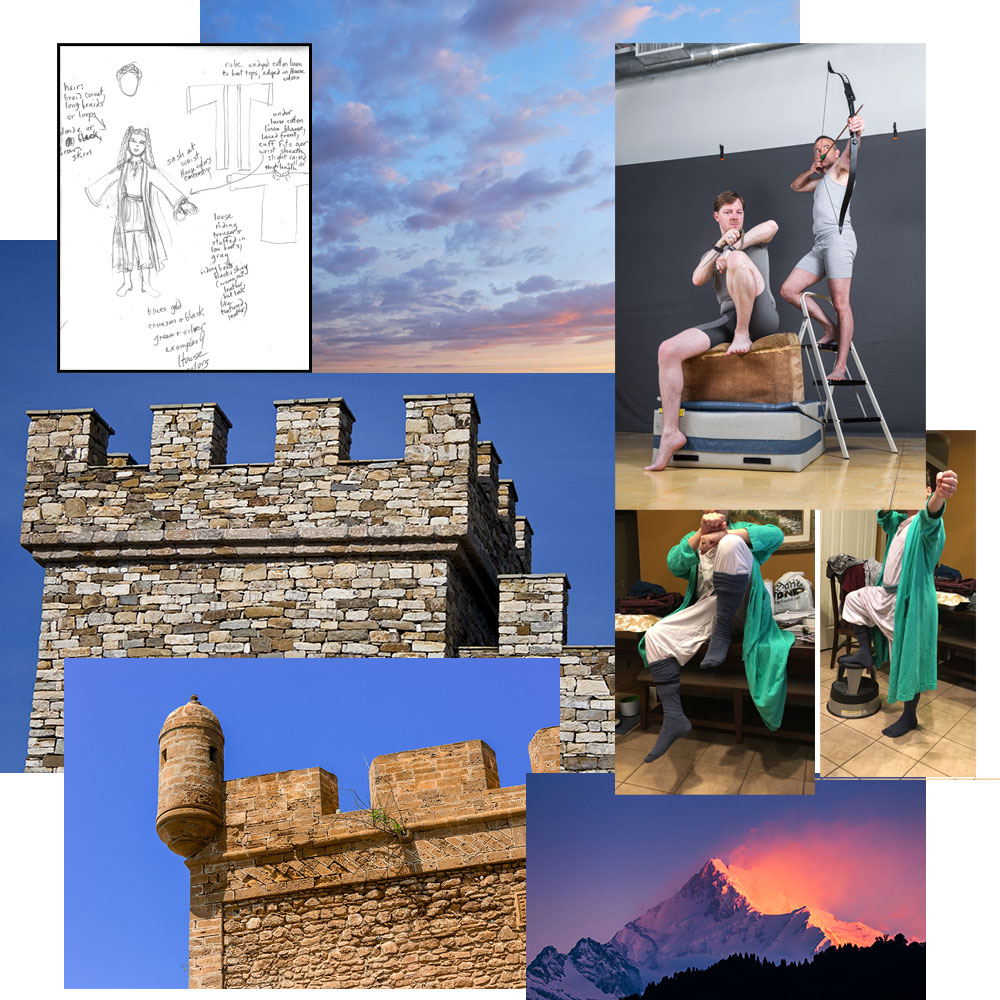
She had a strong vision of what she wanted, and sent me a sketch. It showed two figures on a parapet, one seated with a knee drawn up and a knife, the other standing behind the first with a drawn bow. I sketched a few thumbnails and suggested tilting the composition to add interest and action. Smith agreed.
Gathering materials
Through sheer coincidence, a stock photo artist I like to use for posing reference, Senshi-Stock, was running a Kickstarter with three other stock photo artists, Jade Macalla, Null-Entity, and PirateLotus-Stock. I backed them at a level high enough to request two specific poses, so I asked for a photo of two of them in the pose described above, shot from below.
Once I got the photo, I dressed my husband up in a robe and other baggy clothing that we found around the house, and photographed him in the same pose as the other photo so I could check how the fabric wrinkled and folded.
I gathered lots of stock photos of castle walls, dramatic sunrise skies, and mountainous landscapes before settling on the ones I wanted to use. The mountainous landscape here is a reference for the color scheme I wanted.
Smith also sent me a sketch of the clothing her characters wore, along with notes on the colors and materials.
Definitions: photomontage, photobashing, and overpainting
To explain how I started this fantasy illustration, let me explain a few techniques that I use.
Photomontage
Photomontage is a technique in which the artist arranges a series of photographs to make a new image. The term is also used as a verb. This technique can create different types of images, from collages made of a few photos pasted together to complicated, blended images that you can’t tell started as separate pictures.
Artsy.net has a good page describing photomontage, and showing examples of it.
Photobashing
Photobashing is a sub-category of photomontage, and refers to artists merging and blending photos, 3D elements, and other assets, as part of creating a larger, realistic, composition. It is a complicated version of photomontage developed by game concept artists to speed up design time. To photobash effectively, you need a good, basic grounding in the art fundamentals of lighting, composition, and form. The term originates from “kitbashing,” the technique of combining pieces of different model kits to create new models.
Concept Art Empire has a great article about photobashing.
The difference between photomontage and photobashing
A good rule of thumb to go by is: if it’s a realistic illustration that looks like all the parts are part of the same scene, you’re looking at photobashing. If it’s a more conceptual or abstract image where you can tell the parts come from separate sources, you’re looking at photomontage.
Overpainting
Overpainting means, simply, to paint over an image. It can mean that a picture has just a few touch-ups in a layer of paint on top of it, or it can mean that the artist has worked extensively to create a new painting on top of the picture.
It is a common technique in oil painting. An artist will create an underpainting, defining shapes, lighting, and form or even creating the entire picture in monochrome, then applies layers of paint on top of the underpainting. These can be transparent glazes, to tint the underpainting, or layers of thicker paint using the underpainting as a guide.
Underpainting
For this digital illustration, I used the techniques of photomontage and overpainting. While I do photobashing as well, I’m hesitant to call the final version of this book cover art photobashed, because I just used the photomontage as a sketch, and painted over it.
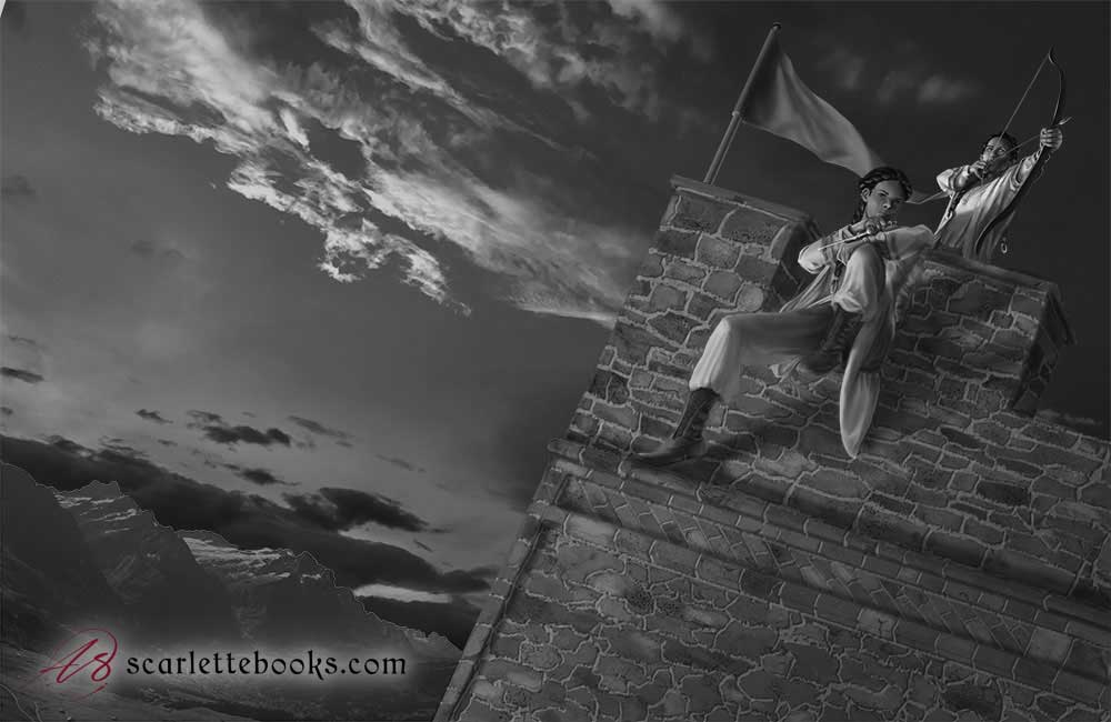
I started a greyscale underpainting using the sketched lines and the photos as a guide. The characters look terrible in this picture because I am focusing on the castle wall. I want to paint the complex stonework first. That’s because it’s easier for me to paint the secondary parts of the image before I work on the painting’s focal point.
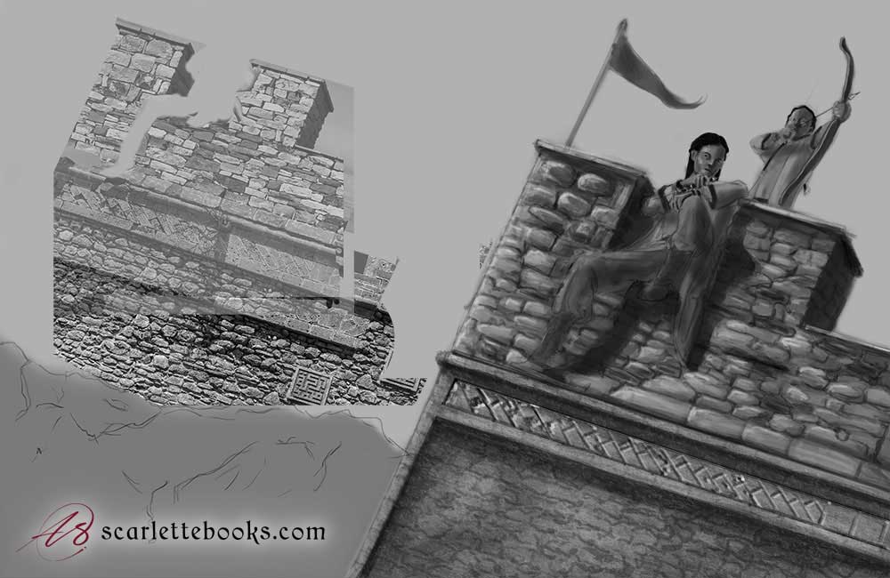
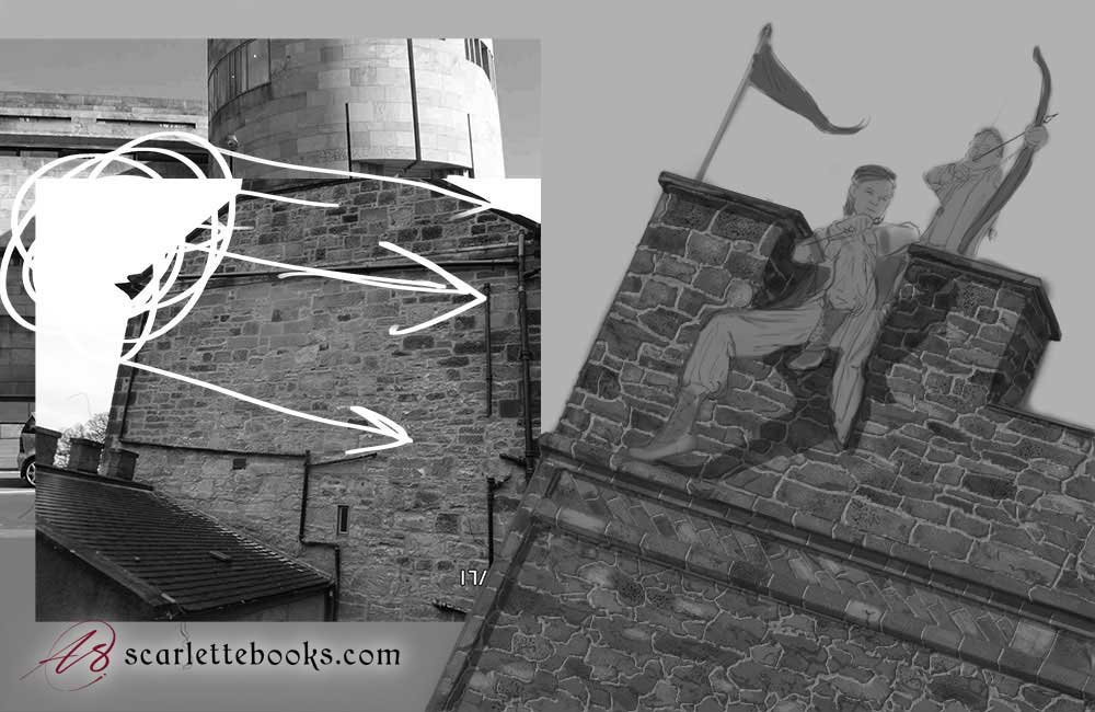
I hated the stonework and started over again, using another photograph as reference. I also drew lines representing the direction of the sunlight on the reference photograph so I’d keep it in mind.
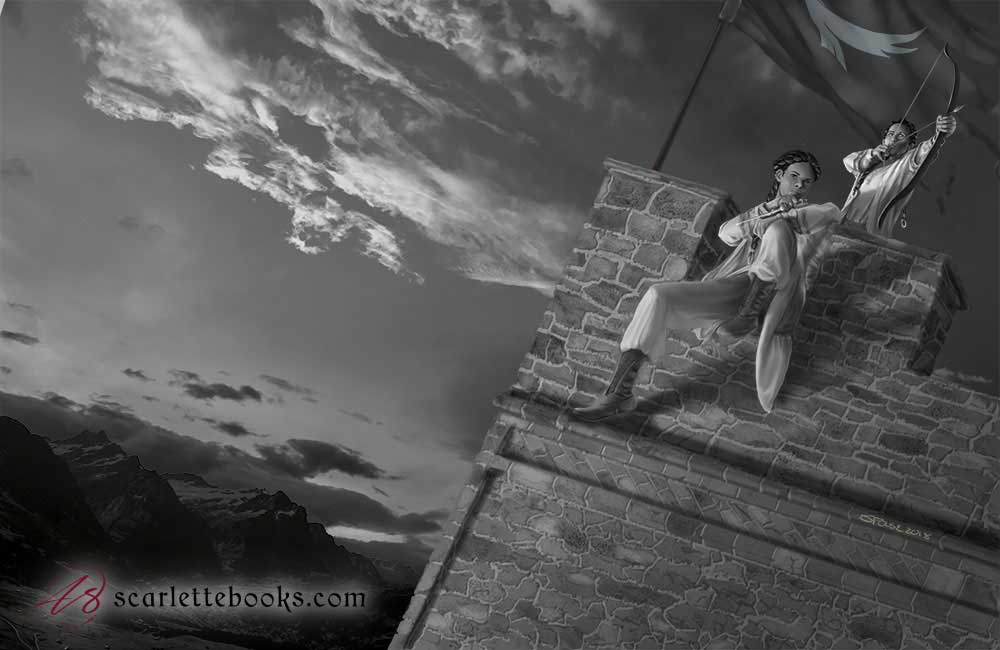
At this point, I am happy with the castle wall. I fully rendered the figures in greyscale, keeping the direction of the light in mind. The far background is still a photo. I thought I’d finished the underpainting at this point, but….
At this point, Smith asked me to change the pennant to a war banner with a bird of prey on it. Now the underpainting is finished.
Next post: Time of Daughters: How to Make a Digital Fantasy Book Cover Illustration Part 2
I’ll leave you here for now. In the next post, I talk about how I added color adjustment layers to form a color underpainting, and overpainted that with more color.
If you want to be notified when I post new articles like this, you can subscribe to my monthly newsletter. And if you’re looking for a cover painting, talk to me.

