Time of Daughters: Making a Digital Fantasy Book Cover Illustration, Part 2
July 17, 2019
Best Stock Photo Sites for Book Covers in 2021
July 31, 2019
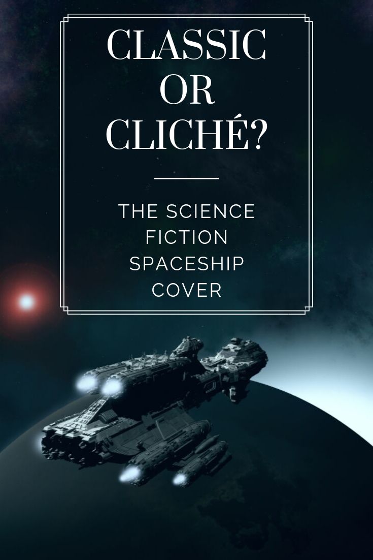
Got a science fiction book to market? Slap a spaceship on that there cover and boot it out the door! The rubes will eat it up!
And yes I absolutely will eat it up! I love a well-done spaceship book cover. I am solidly on the side of “classic” when it comes to this genre of science fiction covers.
Why so many spaceships?
Book covers use symbols that you can recognize in a fraction of a second. When you’re scanning shelves in a bookstore or poring through Amazon search results, you are not looking at each and every cover for more than an instant. Because of that, a cover has to be able to communicate the book’s genre, sub-genre, and mood immediately.
With a book set in space, featuring future technology and far-flung stellar empires, a spaceship is the quickest and easiest symbol. You see a spaceship on the cover of a book and you know what you’re getting into. It’s the job of the cover artist and designer to make that spaceship dynamic and attention-getting so that it stands out while at the same time fitting solidly within its genre.
Spaceship Cover Examples
Here’s a collection of some of my favorite spaceship cover types. The divisions are fairly arbitrary, and most covers could easily fit into more than one.
I have tried to find the names and websites of all the cover artists and designers, but failed for some of them. I welcome comments here or emails to me at augustascarlett@gmail.com with that info.
1. Classic spaceship covers
a.k.a. the John Harris and Tom Edwards category. Evocative and painterly, these covers give you an impression of galactic empires of breadth and depth. John Scalzi’s covers by John Harris, and Glynn Stewart’s by Tom Edwards. A key element of this type of painterly cover is a hazy, light-scattering effect. In atmosphere, particulates and water droplets in the air scatter light to produce that effect. In space, dust will produce haze. (Dust particles will also hole your spaceship unless it’s got awesome shields, but we’ll handwave that away because the effect looks so cool.)
2. Action!
This type of cover tends to feature a spaceship screaming towards or away from you in a tilted composition. Exhaust in a contrasting or complementary color optional, but appreciated. These Lindsay Buroker space action-adventure covers are by Jeff Brown.
3. Military
This category unsurprisingly features wars, battles, and soldiers (and has a lot of crossover with Action, naturally).
Anyway, I love the job Tom Edwards did on Peter Bostrom’s The Last War with complementary blues and yellows to create drama and contrast. I don’t know who did Joshua Dalzelle‘s Battleground cover, but it shows how you can use ships oriented in the three dimensions of space to drive attention to one focal point, in this case the explosion on the space station.
Marko Kloos‘ Terms of Enlistment is an unusually subdued military spaceship cover, soaked in warm but drab tones of orange and brown. The line of faceless, nameless soldiers boarding the docked carrier punctuates the grim foreboding the cover evokes.
4. Ominous
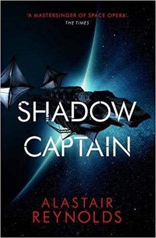
Speaking of grim forebodings, the spaceships on these covers lurk in the darkness, waiting for their unsuspecting prey. Neal Asher‘s Dark Intelligence cover (illustration by Jon Sullivan, design by Claudia Noble) and Alastair Reynolds‘ Shadow Captain (Blacksheep and Lauren Panepinto) utilize silhouettes to make the ship appear threatening.
I couldn’t find the artist/designer of Nick Webb‘s Constitution cover (edit: Tom Edwards! Thank you to a commenter who let me know), but I adore the light on it. The light filters from what looks like a nebula through an asteroid field and is made hazy by space dust.The spaceship resembles a shark lurking underwater.
5. Humor
Let’s change it up a little bit! Here’s a couple of covers with a little bit of cleverness in the design, signifying that the science fiction within is not standard fare.
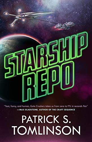
Both Patrick S. Tomlinson’s Starship Repo and Alex White’s A Big Ship at the Edge of the Universe have modern type treatments. 2018/2019 trends are to put the title smack dab in the middle of the cover, often interacting with cover elements. White’s title does this, with the letters disappearing into the edges of the starry smoke cloud emanating from the exhaust of the spaceship at the bottom. Big Ship’s cover design by Lisa Marie Pompilio.
The title of Starship Repo blares out in neon green, resembling the sort of neon tubing you see in sketchy dive bar signs. And then you see the little ship towing the larger ship.
6. Typography
The final category I’m listing today! These spaceship covers all feature typography that interacts with the cover design in a substantial manner.
Jay Allan’s Rebellion’s Fury features a spaceship that looks enough like a futuristic gun that I stared at it for a while, trying to decide which one it was before landing on ‘spaceship.’ The title plays with the shape of the ship. And the whole composition is rotated in such a way that in a landscape orientation, it would resemble a technical manual. I’d love to know who was responsible for the cover.
The designer of M. R. Forbes‘ Deliverance took a standard image of a spaceship screaming towards a planet and popped the title in between them. The ship is breaking the title. Grungy textures overall rough up the composition and give it a feel of desperation.
And finally, Lee Zagrzebski’s Whispers in the Void. Designer Lanea Martin took Elias Stern’s artwork and threaded the spaceship through the title. With the ship’s placement just above the rings of the planet, you get the impression that the ship is on silent running.
I’ve got a Pinterest board full of science fiction covers for inspiration. I could come up with many more categories just from those. Michael Bay Lens Flares? Astronauts? People Holding Big Guns?
Tell me your favorite spaceship covers! Or is there a cover trend you’d like me to look at? Leave a comment below or email me.


















7 Comments
The Nick Webb Constitution cover is by Tom Edwards. There is a copy in his archive of science fiction covers.
Good article! I enjoyed it.
Thank you for letting me know!
Struggling with what “feel” I should choose for the “foundation” novels in a new series I’m launching, this blog post was really useful. Thanks!
I’m glad it helped!
Personally, I’ve ALWAYS loved the SCI-FI Book Covers with various Starship Designs as it, to me, isn’t cliche’ but essential to show the buyer the environment and timeframe of where the story takes place. With the Greats like John Berkey, Chris Foss and John Harris, you couldn’t go wrong with the covers of the 70’s books! It always set the “Mood” for me and made me want to read the book.
I actually agree with you: I was being clickbaity with the title there! 🙂
Great work. I found your site from the Space Opera Title Generator. I will contact you in the future about space Opera Covers. I’m definitely impressed.