
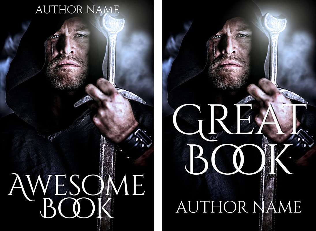
How to spot if a cover is self-published
July 1, 2018
Art assistants are so helpful
June 12, 2019
Books in library.
Having a hard time finding creative inspiration for your fantasy book covers? Here’s five book covers that might help.
There’s no such thing as creativity in a vacuum. You need to keep filling your eyes and your brain with great images, so they can stew around inside your head, break up, and recombine into something new. In order to feed my eye and brain, I keep Pinterest boards full of covers I like, sorted by genre. When I have downtime or need to take a break from something I’m doing, I look over the covers and make notes of elements I’d like to experiment with.
I thought I’d start a series of posts featuring covers I like, talking about specific elements of them. Here’s the first one, featuring 5 fantasy book covers that struck me for one reason or another.
1. A Thousand Years to Wait by L. Ryan Storms
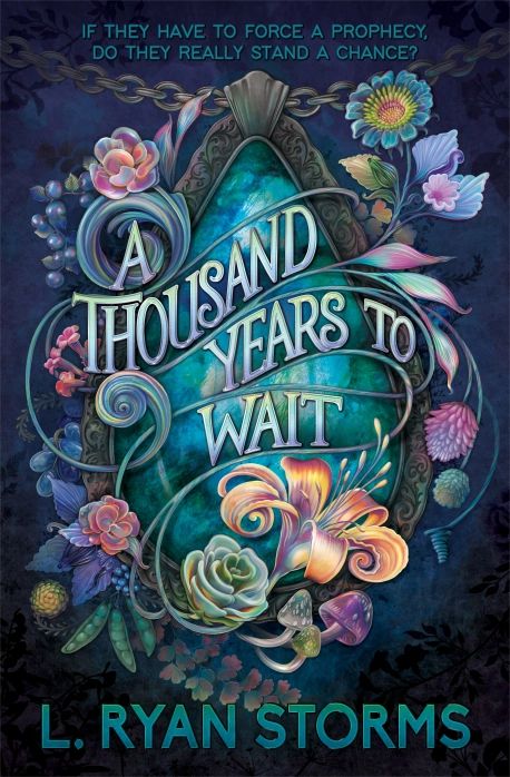
I adore this cover for L. Ryan Storms’ A Thousand Years to Wait. It’s full of cool, soft colors punched up with a warm peachy orange at the focal point, underneath the title. Desaturated blues and greens in the foliage and type, and the metallic elements of the chain and bezel, keep it from being too sweet. (A bezel is a frame that a jewel is set in.)
The cover fits with trends in book graphic design right now, with the title large and centered, the type interacting with elements of the illustration. The orange flower draws your eye, and then the lines of the stems blending into the title brings your gaze up into the title and around the illustration.
One element that I think detracts from the overall fantastic design is the choice of type for the tagline at the top of the cover. While I agree that a simple sans-serif font is a good choice, this font looks a bit too generic. It makes me think of office emails written in all caps. I’d look for something just different enough to avoid that impression.
Author website: L. Ryan Storms
Cover designer: Jess Bieber, entertheglow.com
2. Shades of Human by J. L. Myers
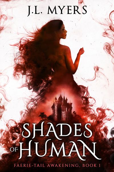
What I love about this cover is the play on the ubiquitous fantasy book cover genre of Woman Wearing Big Foofy Dress. The model is strongly silhouetted against a white background. Her upraised hand adds visual interest and asks the question of what she’s doing–is she holding something tightly? What? Why?
A plain, flat silhouette is boring, so the cover designer keeps just enough detail visible around the perimeter to add volume and interest. They use images of either ink in water or smoke to give texture to the background–you don’t want a plain white background on Amazon because the edges of the cover will vanish–and to beef up the model’s hair and dress. The castle shape echoes the dress shape, to signify the type of fantasy this book is. (And do I detect a bit of a pun with the position of the castle and the “Faerie-Tail” subtitle?)
The title is set in Cinzel Decorative, a font commonly used in fantasy. The title words are stacked to reinforce the triangles in the castle and dress, which contributes to the strong shape. If you saw this book cover from fifty feet away, you’d still recognize it.
Author website: J. L. Myers
Cover designer: Unknown
3. Burden’s Edge by Sever Bronny
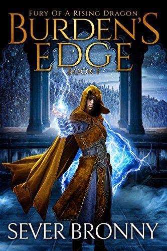
I’m drawn to the blue/yellow color scheme used on this fantasy book cover. Colors opposite each other on the color wheel are often used to provide contrast in art, and this is simple yet effective version.
The blues are desaturated, which makes them recede into the background. The exception is the bright, yet highly saturated blues in the magical energies wielded by the main character. They frame the character and add a sense of action to a mostly-static pose.
The warm, saturated mustard gold of the character’s clothing brings your eye directly to him. The swing of his cloak adds more action. If you squint your eye at the character, you can see that his clothing forms a triangle shape. You’ll often see me pointing out triangles because they’re a basis of composition–which is tipped onto one of its corners, which adds a sense of instability and thus motion to the pose.
The color and gradient in the title pull from the clothing and add that color to the top of the image, balancing it. The white of the author name makes it prominent without taking over the picture.
Author website: Sever Bronny
Cover designer: Deranged Doctor Designs
4. A Feather’s Worth by S. A. Parker
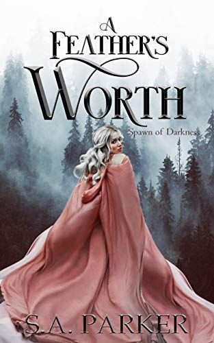
I have a lot of Woman Wearing Big Foofy Dress or Cloak on my Pinterest boards because it’s such a common image. But the reason it’s common is because it’s a good signal for romantic fantasy book covers, although when you look at it here, it’s actually undercutting it and letting you know this is not a sweet and fluffy romance, but something much darker.
I pinned this cover because I love the color scheme of soft pinks and cool greys. That could tip over into too-sweet territory, but the slight desaturation of the pink and the woman’s frightened expression as she looks back at you gives it an edge. The shapes of her hair and the cloak get really sort of creepy, the longer you stare at them.
You’ll see the triangle that’s my favorite type of composition here in her cloak. The movement of the fabric adds action and makes it seem almost alive.
Looking at it, I think I might make the title slightly smaller and move it further up the cover to give her head room to breathe, as it seems a bit cramped. I’d also move the subtitle to the top of the cover. You can see the problem with white covers here: you can’t tell where the edge is and it looks a bit unbalanced. Adding the subtitle to the top makes it more prominent and serves as a line defining the top edge.
Author Facebook: S. A. Parker
Cover designer: Unknown
5. The Sorcerer’s Secrets by Jason Miller
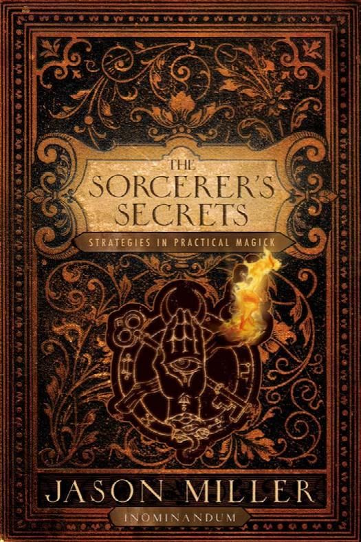
This one isn’t a book published in the fantasy genre, but one published in the New Age/Magic/Pagan/Religion/etc. nonfiction genre. (No comments on the validity of “nonfiction” please: we’re focusing on the covers here.)
I pinned this one to my Fantasy Book Covers board because I think it’s a fabulous idea for a book about a magician or sorcerer who uses a grimoire. A strong trend in fantasy right now, as shown by book #1 in this list, is non-representational covers with elaborate designs like this one. If you make the title bigger, then texture and erase bits of the type to make it look like a well-handled book whose top layers of cover were wearing off, you’re bang on trend for 2019.
I also like the way the torch in the center emblem lights up part of the cover and adds a three-dimensional effect and life to the flat arabesque design.
Author website: Jason Miller
Cover designer: Ian Shimkoviak, The Book Designers

