
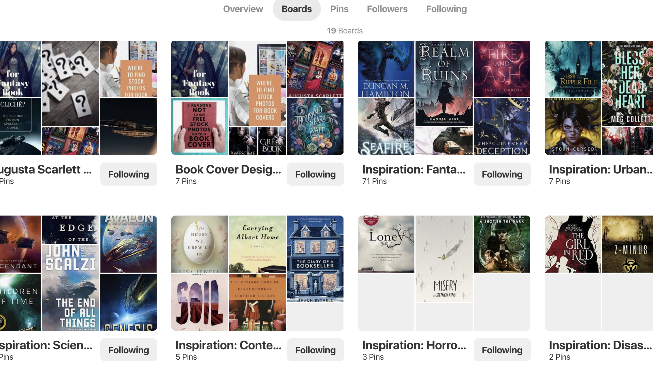
Pinterest: book cover inspiration
August 21, 2019How to design a book cover
February 10, 2020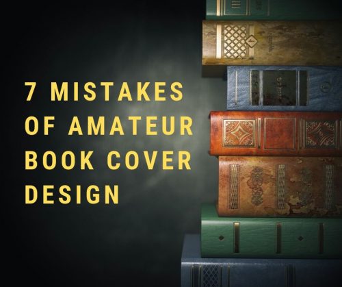
What makes a book cover look professional, besides 10 years of graphic design experience? Here are 7 mistakes that amateurs make when creating book covers.
All the bad example covers are ones I threw together using titles from my random generators. I don’t want to pick on any authors who may have created their own covers. The links in the text link to other examples on Amazon.


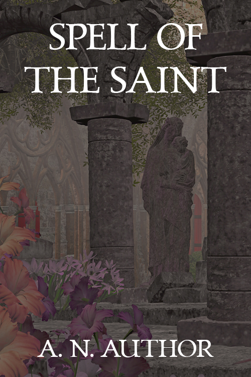
1. Large flat areas of color
Large flat areas of color are common on non-fiction book covers, but not in fiction. Fill in empty space with a texture or with words. If you have graphic design experience and understand how to use negative space, go for it. But if you don’t, your results won’t be good.

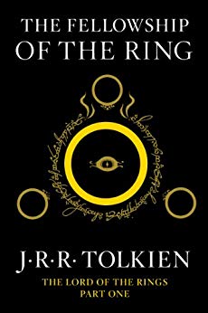
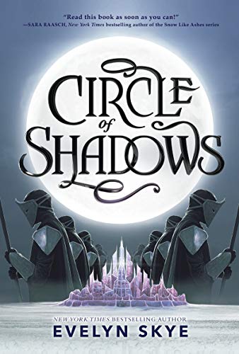
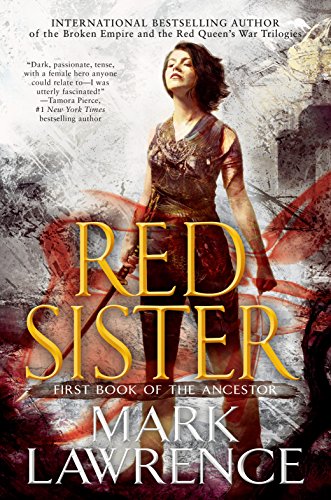
2. The focal point of the design doesn’t ‘pop’
‘Pop’ means to stand out. You can do this with color, composition, negative space, or light glows, among other things. The focal point should be immediately apparent, because you have less than one second to grab the reader’s eye and make them interested.
The more experienced you are, the more subtle you can be. I love the cover for Leigh Bardugo’s Ninth House. The broken-up letterforms force you to look twice at the cover. And then you see the snake….


3. Conflicting lighting in stock images
If you montage two stock photos into one picture, they need to have complementary lighting. You can’t merge one high-key image (bright, few shadows) and one low-key image (dark, dramatic) nicely. If the light comes from a different direction in each photo, you need to account for it in the rest of the picture. The two pictures will never blend properly if you don’t. Yup, even in photomontages that aren’t supposed to look like one photo. Humans are used to consistent lighting schemes in real life. Inconsistency draws the attention in a bad way because the brain says, “Something is wrong here.”
I show one of my covers as the good example because I think that showing you a good match in light direction and a bad match in light direction right next to each other will illustrate my point. The good version is also color-corrected to blend the jacket and model together. In this cover, I corrected the color with a red-tinted image, on top of the other images, that I set to a low transparency. I then played with layer blending modes until it looked good.

4. Treating text as an afterthought.
The best book cover designs involve the text from the very beginning. The designer and artist ensure the picture’s composition includes the title and author name. Ninth House above is an obvious (and currently trendy) example.
If you commission a painted cover for your book, I suggest you design the text placement first. That way the artist can design the composition to account for it.


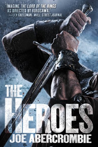
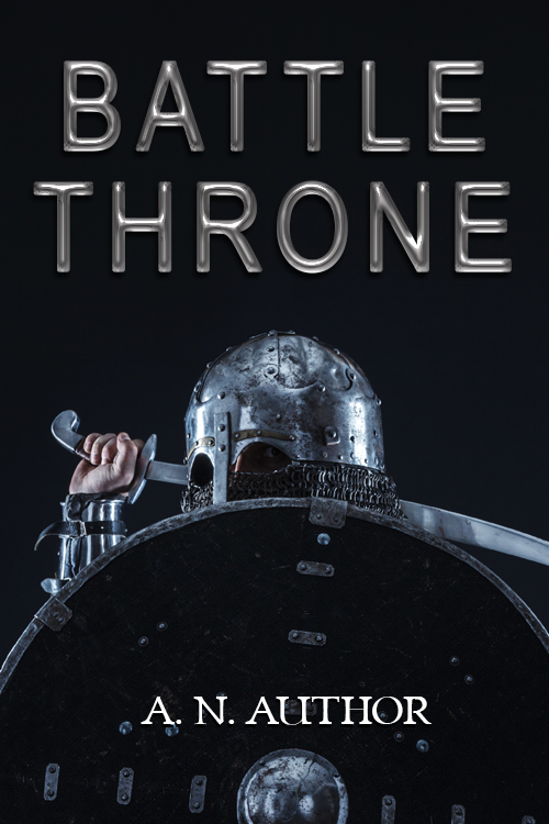
5. Scared of putting text on top of the artwork.
Too many amateurs scrunch the title waaaaay down at the bottom and put their name waaaay up at the top. Ideally, you first research what your genre’s conventions are and then work with the artist to develop a composition that takes the text into account. Most traditional publishers put the text smack on top of the artwork, even interacting with it. Did you pay a lot for your cover art and hate to hide it? Put the full artwork on your website where your fans can see it. Slap your title on top of the art on the book cover.
Joe Abercrombie can get away with breaking this rule because he’s Joe Abercrombie. But mostly because the cover is carefully designed around the text. The shape of the helmet points up. The lighting of the helmet is dark at the bottom and light at the top, which draws the viewer’s eye up to the point. Abercrombie’s name is a bright, attention-getting red. All three elements make the title and author name the focal point. (See point #4.) The title is also in black on a white background, so it pops. (See point #2.) Note that the white background is not left flat, but has grungy textures on it. (See point #1.) Go look at all of Abercrombie’s recent covers. He’s been getting some fantastic ones.
I wrote an entire post about this a while back: How to Spot if a Cover is Self Published.
6. Default Photoshop fonts and text effects.
Do not use more text effects than a subtle drop shadow or a subtle gradient if you are new to book cover design. Most text effects look muddy at Amazon search results size, and are terrible to boot.
Do you think your title on the book cover in a flat color looks boring? Then you are using the wrong font. It will still look wrong with a pillow emboss and outer glow. Go look at creativemarket.com, filter by price range, and invest in a readable, interesting font. Avoid Arial, Times New Roman, and most fonts that came default with your computer.


In other words, there is absolutely nothing wrong with flat white text, or extremely subtle effects.

7. Author name unreadable.
You shouldn’t go as big as Robert Jordan’s name if you’re not as big as Robert Jordan. But when your name is tiny it looks like you’re apologizing for writing the book. You wrote a book! Be proud! Make your name readable because you want readers to remember your name and buy more of your books!
Caveat
You can find bestsellers that break every guideline I list here. Of course, there are always books that break the mold of current design, sell a ton, and set new fashions that everyone else copies. Your book will not be the one that does that. (Statistically speaking!)
[This post is an edited version of a comment I made on Reddit.]

