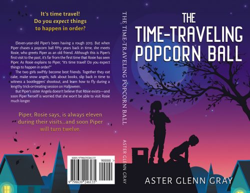
When Aster Glen Gray contacted me about this book, it ended up being a bit of a challenge. Not so much for the cover–although we went through a few iterations to nail down the right look–but for the title! Long words are always a bit hard to fit properly onto covers, especially when they’re accompanied by short words.
It’s easy to get awkward spaces around the title if you stack long and short words, but if you put the words on the same line, you need a smaller font. Smaller fonts mean your title is harder to see, and that leads people to the temptation of making the space between the letters smaller. But when you smush letters together like that, it’s significantly harder to read the words fast, and you have less than a second to get the attention of someone who is scanning books on bookstore shelves, or who is scanning through Amazon search results. It’s not worth it! Don’t smush!
This is why I tell authors who want to do their own cover and are new at it: stick to short words for your title. It’s easier to design with them if you’re not familiar with typography.
The ultimate solution is to find a tall, thin font that is designed to look good, and to use that for your title when it’s comprised of long words.


